Benjamin Kergueno
Graphic identity
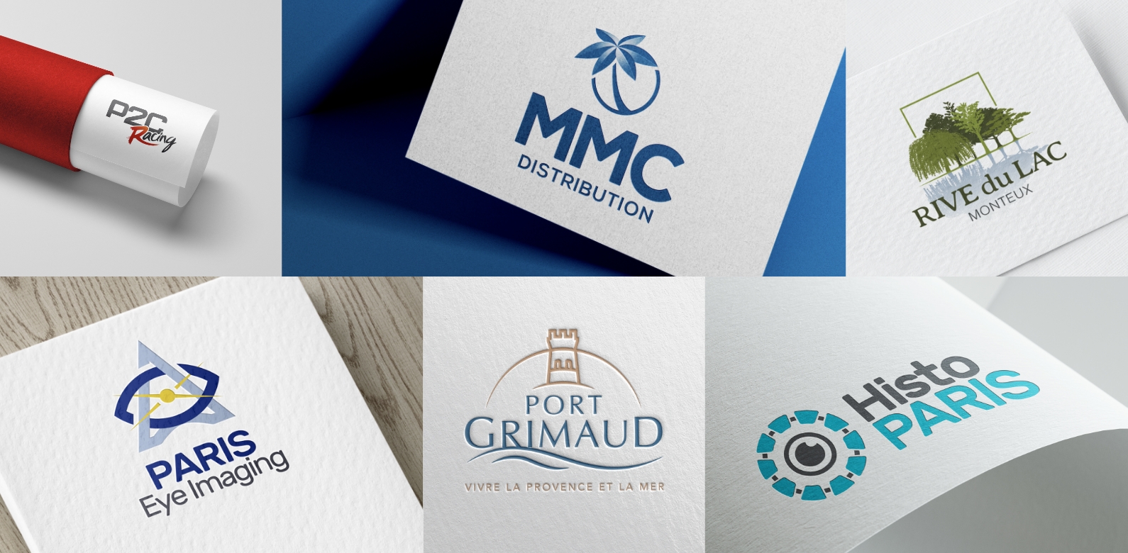
Ideogram Design will work with you to create a logo that reflects your company's image and adapt it according to the rules of communication for perfect adaptation to all communication media.
You are unique, and so is your logo! So it needs to stand out as much as possible if it is to be identified among its peers. So even if it's tempting to conform to existing models, be careful to avoid trivialising your logo and blending in with the competition!
A good logo should reveal your identity and graphically convey the values you stand for in your project. It must be understood by everyone, and fairly quickly. Simplicity remains a safe bet in the sense that the simpler a logo is, the more legible it is and the more it will stick in consumers' minds.
A logo should appeal, catch the eye. This expression is particularly appropriate since a logo is above all a visual stimulus. And vision is always an interpretation by the brain. This means that the logo is perceived before it is seen.

A logo must be instantly recognisable. For example, can you redesign the Carrefour hypermarket logo? Probably not. If you were asked to describe its main graphic characteristics, what would you draw? Arrows, a square, colours? How many would draw a "C" in a square? It doesn't matter, because what matters in the end is that we all identify this logo as soon as we see it!
A logo is not an illustration, let alone a comic strip! It must be a synthesis of the values of the company it represents.
As you have already seen in the previous paragraph, the whole job consists in drawing a caricature, i.e. extracting in a few strokes the differentiating characteristics of the entity or founding concept.
Graphic conciseness, a high level of abstraction or stylisation and extreme simplification of the colour code are therefore essential (which implies that the designer has, among other things, a solid background in drawing...).
As you can see, IT isn't everything. So don't be fooled by 'tricks' such as gradients, shading or relief, whose only purpose is to make the design look 'sexier': the logo must be able to live without them. If it can't, chances are it won't have enough identity...
Don't forget that complexity is confusing, whereas simplicity is reassuring. Not to mention that it considerably increases the strength and impact of the logo.
But simple does not mean simplistic, quite the contrary!